Tuesday, December 2, 2008

This weeks reading on grocery stores made me wonder if this method of organization is echoed in other types of stores. The larger stores, like Petco and Walgreens is organized in such a manner, so I looked a liquor stores. This one has no name that I could find. The neon lights say liquor, liquor, beer, wine, so in my head that is the name of the store. There are very small lanes which people can walk down, but there was no organization that I could find beyond a wine section, beer in the fridge, liquor along the western half of the store. Sambuca was next to vodka and amaretto. The rum section was small. All and all, it is similar and very different from the grocery store model.


This is my local Publix store. There are very few windows located in the front of the store. It's very odd, almost casino-mentality: if the customer can't tell how long they've been here, they'll shop longer and buy more. It works. I lose track of time in grocery stores frequently. The lanes were large and well-lit. Signs were everywhere. The entire store smelled like bread. A very different experience than Liquor, Liquor, Beer, Wine store.

Multi-Family Units

To be honest, I don't know much about this building. It's right next to I-85/I-75 and 14th St. The building is recent, but located so close to Atlantic Station and all their high-rise luxury condominiums, it looks a little dated and sad. It falls somewhere between the garden-view walk up and the high-rise. It's actually rather reminiscent of several mid-level hotels.
This building complex I am quite familiar with as it is my own. It has it's own golf course and three swimming pools. It's subdivided into different enclaves, Maison, LeFue, ect. It's your basic gated complex, with garden view apartments and townhouses . . . and more speed bumps than sense. Honestly, nine speed bumps up the 3/4 of a mile to my apartment. Another nine on the way down the hill.


These I found on the way to work one day. I was curious and was running early, so I ignored the PRIVATE DRIVEWAY: DO NOT ENTER sign and went exploring. I found individually owned row houses, with some slight degree of variation. One house had an awning, another had shutters. I found them absolutely charming. And the people were quite friendly, even if their sign was not.

Spaces of Play

So, once again, I'm am trying to blog on this topic, spaces of play. Here's hoping this one survives. When my father came to visit, we did many typical touristy things, like visit the aquarium. This visit, and looking over the pictures taken, sent many ideas flowing around my brain. One was the number of maps and signs available. It was actually more confusing with all the information than just wandering around. The aquarium is set up with different zones, the cold-water zone, the tropical reefs, the river, and the petting zoo. Everything was curved, lending a degree of privacy and solitude to a very crowded and noisy environment. The glass itself, at least in the reef, looked very much like a movie theatre. At times, it was like watching someones screen saver.

The other random thought was on the children. Much of the time, all I could hear was "Where's Nemo? I can't find Nemo." By the time we reached the end of the reef zone, the children were stressed out, and many missed seeing the clown fish aka "Big Nemo." As this entertained three generations of my family as well as the next generation, it qualifies as a space of play.

The other space of play is the High Museum. This is a very different environment. No petting zoo, no touching, no food is allowed among the artwork. This past weekend, there were numerous special events to keep people entertained as they waited in line to get to the special Terracotta exhibition. The museum had different shows set up in the lobby and a local martial arts school was dressed as the soldiers. The lobby of the old building is particularly well set up for such shows. It is clear
and open to the roof, some five levels above the main floor. This part of the museum is all curved lines and glass. It did prove a way to be somewhat entertaining as one waited (and waited) in line.


Ruins I have Known


I begin this blog assignment at the end of our class. It is more natural for me to look at ruins and try to image what was once there than to analyze whole buildings.


This is not the photo I originally planned on using for my first picture of a ruin. This is one taken at a field school in Antigua from the summer of 2004. They're actually all standing around a grave we had to pick-ax our way to. You can barely seen the remnants of the mausoleum, with the slab of stone in the right front part of the picture of of the grave stones.


The picture on the left is from Tulum, Mexico. It has been restored to what archaeologists think it originally looked like. On some walls, you can see the remnants of red paint. It was difficult to take a picture, both because I had very little film left and the tourists were all over the place. Very controlled place, almost archaeological Disney. It was very pretty though.
This final picture is one of the many parking lots around Arts Center MARTA station. There is no clear evidence about what it was before it became a parking lot. It is not especially well-cared for. There are vines growing all over the place. This place tells me little about the history of this area. Not pretty, not tourist-related, not archaeological, but still a ruin.

Monday, December 1, 2008

Supermarkets and Grocers


The first photo is taken of the Atlanta Farmer's Market.  This building is very much in the tradition of the markets that were built in the 1950s.  The front of the building is entirely walled with glass windows and posted on them are various signs commenting on sales occurring within the store.  It is located in a shopping center with other retail stores.  Inside it is like any other mass grocery store with aisles of various products and a number of checkout lines at the store's front.


Next, is a photo of a small grocer that specializes in hispanic foods.  It is located off Buford Highway and is incredibly small.  Unlike the Farmer's Market or any of the other larger
 markets, it is very intimate.  There was no more than three people working inside.  The foods were also unlike anything that would normally be purchased.  The parking lot outside was also very small and the building itself looked as though it had been used many different times for varying purposes.

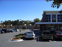
Finally, the last photo was taken merely to emphasis the fact that often times a grocery store or convenient store will be used as a shopping center's "anchor."  This Aldi store is the only business open in this newly built shopping center.  It is located on one end of the complex with all the other, much smaller spaces, yet to have occupants.  Although the store does not classify as a market, per se, it does show how developments work in their early stages; that is build a major convenient store to anchor the complex and it's future inhabitants.  

Thursday, November 27, 2008

Multi-Family Housing in Charleston, SC

While I was vacationing in Charleston a few weekends ago, I decided to look for examples of multi-family housing located on the peninsula. Many people see Charleston for the homes on the Battery or Rainbow Row, but with the height requirements and small size of the peninsula, multi-family housing is often required to accommodate the mass of people wanting to live downtown.

Berkeley Court, Charleston, South Carolina. This mulit-family building was constructed in 1922 and is located at the corner of Rutledge and Beaufain. It holds some 30 units and is set-back at a diagonal with part of the building fronting Colonial Lake. It's detailed and elegant entrance help surmise the era in which it was built, an age where apartments were often designed to cater to a middle-class clientele. Even though apartments like this were built for the middle-class, the apartment’s location a block North of Broad and on the water raises the value of the land and rent, suggesting renters that are more affluent. To my eyes, it does not appear to look like it was built to look like an apartment building, but the numerous balconies on the front give away its multi-family use. Built of concrete, brick, and tile, it combines numerous styles such as Italian Renaissance and Spanish Colonial; perhaps, as a way to appeal to individuals with different tastes. The facade of the building cements it in history as one of the middle-class apartments of elegance that were so popular in the 1920s and 1930s.

Sergeant Jasper Apartments, Charleston, South Carolina. Located near the tip of the peninsula is Sergeant Jasper, a 1950s multi-family high rise apartment building. It's 218 units offer mostly studio apartments, much like the other apartment buildings of the 1950s. Elegance was not the issue in this time period, efficiency was. The design made it more economically friendly to builders, but also to family's and singles in the lowcountry. With lower design standards and lower rents, it especially appeals to students at the nearby College of Charleston. In another strike against elegance, the exterior of the building is simple with no ornate detailing like that on Berkeley Court.

58 Rutledge Avenue, Charleston, South Carolina. What may appear as a detached dwelling is in fact a multi-family housing unit. If you look closely, you can see five mailboxes to the right of the front door of this early 20th century Queen Anne style house. The idea of converting houses into apartments has been seen throughout numerous eras and it is currently a phenomenon in Charleston. With such little land to develop and strict height requirements, dividing houses is a common practice. Parents of college students and/or investors take advantage of these issues, renting out space to young families and singles. Some are divided by level, but depending on the scale of the house (as in this case) divided up into even more units. It may not be your typical multi-family apartment building, but it is a perfect solution to many in the city of Charleston.

Tuesday, November 25, 2008

The Growing Home

Above are two mid-century homes that typify the American dream after World War II. The first home is a recently restored American Small House (with an addition off the side), while the second is a more classic ranch style home.

The American Small House is the more modest of the two homes, but like the ranch sits low to the ground and makes little effort to make any statement beyond, "I'm functional". The ranch on the other hand is a bit more elaborate. Its an "early" ranch, probably from the 1950s, as can be seen by the level of detail on the porch and the quality of the brick work. Even still, it is a modest structure compared to the Craftsman Bungalows and Colonial Revival cottages that came before it.

This ranch is located in an urban neighborhood and therefore has a more modest yard than most houses that fall in this style category. However, just like the American Small House above, the ranch stays low to the ground at only one story and displays little ornamentation. In many ways it fits nicely into the 1920's dominated neighborhood where it resides thanks to its similar massing.


While the new construction above could be judged as an extreme example of infill, it does a great job of conveying a completely different message than the earlier houses. This home/castle, which actually now sits on a lot once occupied by a ranch, makes no pretenses to fit into the neighborhood. It conveys a sense of superiority and has no qualms displaying its vast amounts of space, towering over its neighbors. It makes an attempt to hearken back to some sort of Gothic-style, while the ranch and American Small House make little effort to recall a historical style - probably for monetary reasons.

Just like with commercial design from the present day, 50-100 years from now people will look back at the construction from the late-20th/early 21st century and marvel at how plentiful our resources were that we could waste materials and energy on houses this massive for single family homes.